


Choosing or creating a font for a web project may seem difficult, given the significant impact it can have, but if you keep in mind certain basic guidelines to apply to the style of the web typography of our texts, the result will be completely professional and at the same time harmonious, though, of course, always keeping the brand's values and personality in mind.
After all, we all make typos without realizing it. In this article, we want to help you recognize and avoid them. That’s why the purpose of this article is to provide a checklist to help you verify that you’ve used the correct form in all your Web fonts.

What are the 7 most common mistakes in web typography?
1- Incorrect line spacing
Line spacing is an important factor to consider when it comes to the final result of our project. It is essential respect personal space and that the various elements be spaced far enough apart so that there is no sense of claustrophobia or extreme density.
2- Ignoring readability
This is one of the most important of all—and one of the most common mistakes. The text should be easy to read., if we want to convey a message, we need to make it easy for viewers to understand—not make it harder for them.
Keep in mind that the main purpose is to make the text easy to read; the typography itself doesn't need to draw much attention, and you might be wondering, "But then, Isn't design important? Yes, it is, but we must work to integrate it in a way that does not hinder the readability and comprehension of the text, in order to strike a balance between form and function and ensure that the text can be read without difficulty.
3- Disregarding the hierarchy
When we talk about hierarchy, we are referring to correctly distinguishing the different elements of the text in order to properly highlight the importance of each part and thereby help guide the viewer’s reading experience effectively. If hierarchy is not established, the design becomes very confusing, to the point where the user does not know where to look first.
For example, if we take as a guide a newspaper lead, we see that it contains a title, a subtitle, and a paragraph. So, as we all know, the title uses the largest font size to grab the reader’s attention; next, the subtitle should be slightly smaller to create contrast with the title, and finally, the body text should use a font size and weight that makes for smooth reading and prevents eye strain.
4- Neglecting alignment
Centered alignment can be very tempting, but it should be avoided, since for long texts this alignment does not make reading much easier.
On the other hand, if we align to the left, makes reading much easier. It helps our eyes by identifying the beginning of each line of text and maintaining continuity as we read the body of the text.
As a general rule, the text should be organized in a logical manner. You should avoid “freestyle” and align some to the left and others to the right; whenever possible, use one-sided alignment.
5- Using too many fonts
Using all kinds of fonts makes your design look unprofessional and amateurish. In a single design You shouldn't overuse too many fonts, we may end up compromising its readability, and it gives the impression that the choice wasn't well thought out.
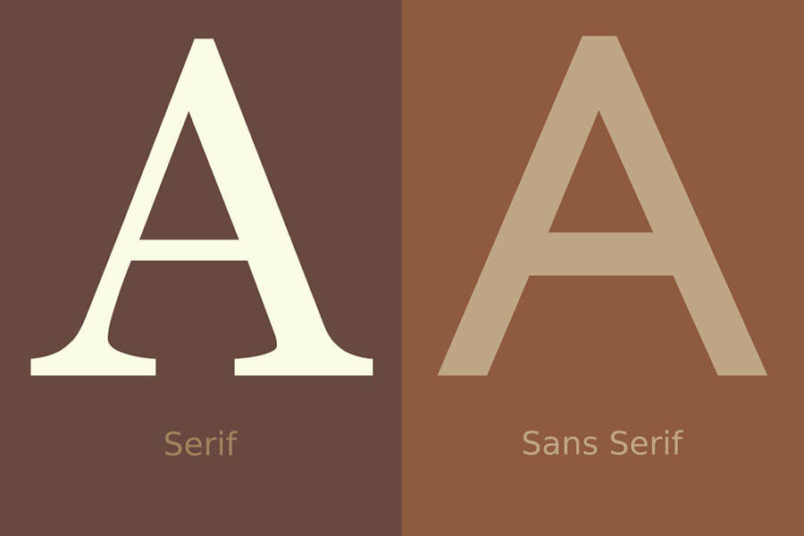
As a recommendation, choose fonts from large typeface families such as Gotham or Swift, and if not, two fonts are enough to create a good design.
6- Using double spaces by mistake
One of the most common web typography errors involves text sizes.
Double spaces create gaps within blocks of text, which disrupts the natural flow of reading for the user. Be sure to check for double spaces and remove them—it's as easy as using the commands CONTROL + F or COMMAND + F (MAC) and find the double spaces by double-clicking on the space.
7- Incorrect use of capital letters
And finally, the misuse of capital letters, the arrival of the social media have led us to write more and more nonsense. For example, we now interpret a sentence or a capitalized word as the person raising their voice.
Using them in our paragraphs can make reading difficult, which is why it is recommended, for example, Use capital letters in our titles sparingly.